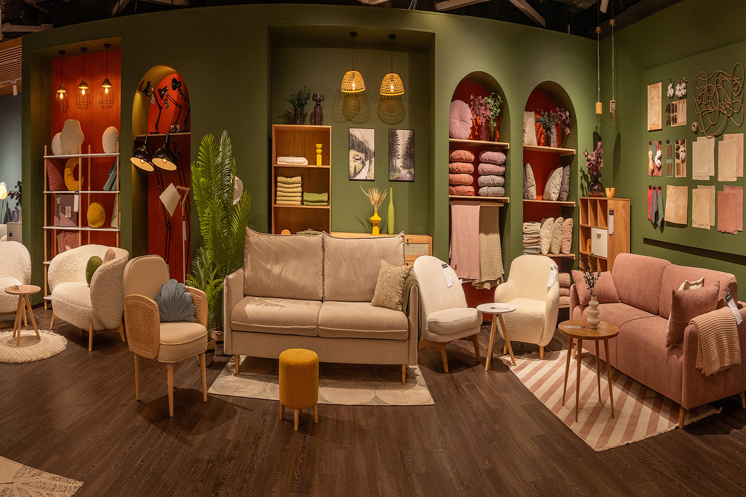
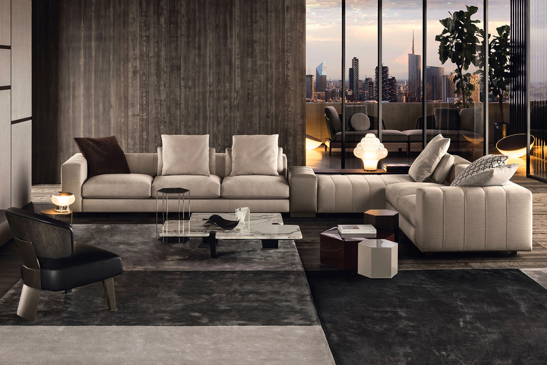
Visual harmony is the foundation of effective design, creating order and meaning from individual elements. When a design achieves harmony, it feels complete and purposeful rather than random or chaotic. In this article, we'll explore the fundamental principles that contribute to visual harmony and how they can be applied in digital design.
Balance: The Cornerstone of Visual Stability
Balance creates a sense of stability and structure in design. It's achieved through the careful distribution of visual weight across a composition.
Types of Balance
Balance in design can take several forms, each creating a different feeling in the viewer:
- Symmetrical Balance: Elements are equally distributed on either side of a central axis, creating a sense of formality and stability. This approach works well for institutional designs where trust and reliability are paramount.
- Asymmetrical Balance: Visual weight is balanced through contrast of size, color, texture, or position. This creates a more dynamic and interesting composition while maintaining overall equilibrium.
- Radial Balance: Elements radiate from a central point, creating a sense of movement and focus. This is particularly effective for designs that need to direct attention to a central message or call to action.
Achieving balance doesn't mean making everything uniform—it means creating equilibrium between different elements so that no single part of the design feels disproportionately heavy or light.
Rhythm: Creating Visual Movement
Rhythm refers to the regular repetition of elements that creates a sense of organized movement through a design. It helps guide the viewer's eye and creates a cohesive experience.
Patterns of Rhythm
Several patterns can establish rhythm in design:
- Regular Rhythm: Elements repeat at predictable intervals, creating a steady, measured feeling. This works well for information that needs to be easily scannable.
- Progressive Rhythm: Elements change in a logical sequence, such as increasing in size or intensity. This creates a sense of progression or hierarchy in information.
- Flowing Rhythm: Elements follow curved or undulating patterns that create a sense of natural movement. This can make designs feel more organic and approachable.
- Random Rhythm: Elements appear without a predictable pattern but still maintain cohesion through consistent styling. This creates energy while avoiding monotony.
Effective rhythm creates a sense of continuity that helps users navigate through content without feeling disoriented or overwhelmed.
Proportion: Meaningful Size Relationships
Proportion refers to the relative size and scale of elements in relation to each other and the whole composition. Harmonious proportion creates a sense of order and helps establish information hierarchy.
Approaches to Proportion
Several approaches to proportion can enhance visual harmony:
- The Golden Ratio (1:1.618): This mathematical relationship occurs throughout nature and creates aesthetically pleasing proportions that feel inherently balanced.
- Rule of Thirds: Dividing a composition into a 3×3 grid and placing key elements along these lines or at their intersections creates balanced, engaging designs.
- Modular Scales: Using a consistent ratio to determine the size relationships between all elements creates cohesive visual systems. This is particularly valuable in responsive web design.
Intentional proportion helps establish which elements deserve attention and creates a sense of order that makes designs feel more professional and considered.
Unity: Creating Cohesive Wholeness
Unity is the principle that ensures all parts of a design work together to create a cohesive whole. It's what makes a design feel complete and intentional rather than a collection of disparate elements.
Elements of Unity
Several approaches can help achieve unity in design:
- Proximity: Placing related items close together signals their relationship and creates visual groupings that organize information.
- Repetition: Consistently using visual elements, colors, textures, or shapes throughout a design creates recognition and cohesion.
- Continuation: Creating visual paths that lead the eye from one element to the next helps establish relationships between different parts of the design.
- Visual Theme: Developing a consistent visual language through color, typography, and styling that reflects the purpose and personality of the design.
Unity doesn't mean monotony—contrast and variety remain important for engaging designs. The key is ensuring that every element feels like it belongs to the same family and serves the overall purpose.
Emphasis: Creating Focal Points
Emphasis directs attention to the most important elements in a design. Without clear emphasis, users may struggle to identify key information or actions.
Techniques for Creating Emphasis
Designers can create emphasis through several approaches:
- Contrast: Making an element distinctly different from its surroundings through color, size, or style makes it stand out.
- Isolation: Separating an important element from other elements draws attention to it.
- Placement: Positioning elements in naturally prominent locations, such as the top of a page or at key intersections in the layout.
- Direction: Using lines, shapes, or images that point toward important elements guides the viewer's attention.
Effective emphasis creates a clear visual hierarchy that helps users understand the relative importance of different elements and navigate content efficiently.
White Space: The Element of Breathing Room
White space (or negative space) refers to the empty areas between and around elements in a design. Far from being "wasted" space, it's an active component that contributes significantly to visual harmony.
Functions of White Space
White space serves several important purposes in harmonious design:
- Breathing Room: Giving elements enough space prevents visual clutter and cognitive overload.
- Focus: Surrounding important elements with white space makes them stand out and increases their visual impact.
- Relationship Definition: The space between elements helps define their relationships and create logical groupings.
- Readability: Adequate white space in typography and between content blocks significantly improves reading comprehension and experience.
Thoughtful use of white space distinguishes sophisticated design from cluttered, amateur work. It requires confidence to leave space "empty" rather than filling every available area.
Applying Harmony Principles in Digital Design
Translating these principles to digital interfaces requires consideration of both static visuals and interactive elements:
Responsive Considerations
Digital designs must maintain harmony across different screen sizes:
- Establish proportional relationships that can scale rather than fixed measurements
- Use flexible grid systems that maintain relationships between elements
- Prioritize which elements maintain emphasis when space becomes limited
- Adjust white space proportionally rather than eliminating it on small screens
Interactive Elements
Consider how harmony principles apply to elements that change with interaction:
- Maintain visual continuity during state changes (hover, active, etc.)
- Create balanced transitions and animations that feel natural
- Use consistent interaction patterns that create rhythm in the user experience
- Ensure that interactive elements receive appropriate emphasis based on their importance
Conclusion: Harmony as an Ongoing Practice
Visual harmony isn't a formula that can be applied mechanically—it's a sensibility that develops through practice, observation, and refinement. The most effective designs balance these principles in service of communication goals, creating work that feels both aesthetically pleasing and functionally effective.
As you apply these principles in your own work, remember that they're guidelines rather than rigid rules. The ultimate test of harmony is whether the design effectively communicates its intended message and creates a positive experience for the user.
By developing your understanding of balance, rhythm, proportion, unity, emphasis, and white space, you'll build a foundation for creating designs that feel intentional, cohesive, and visually satisfying.


